The Logo of KEIFU
The logo of KEIFU evolved from the infinity symbol.
The graphic design integrates the concepts of a fork and a spoon. This symbolizes the business’s main items of operation as centering around food and dining. In addition, this logo also indicates an expectation of developing into a company that boasts infinite creativity and can provide a wide variety of products and services.
The oval-shaped logo is intended to convey a feeling of stability, bringing customers a sense of trustworthiness and safety. The red color represents fervor in service and a joyous atmosphere, which we hope will give customers a sense of enthusiasm, vitality and joy.
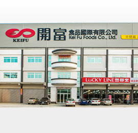
Kei Fu Foods Co., Ltd. Headquarters
Innovating History

| 2000 |
Kai Shin Foods established.
|
|---|---|
| 2006 |
Merger with “Kai shyong Foods Co., Ltd.” (established in
1990) |
| 2006 |
Launched exporting food ingredients to foreign markets.
|
| 2007 |
Merger with Teaplus.
|
| 2007 |
Teaplus Food & Beverage Service Co., Ltd. Established.
|
| 2010 |
Number of Teaplus retailers in Taiwan reached 100.
|
| 2012 |
Corporate identity system reconfigured and headquarters officially renamed as “Kei Fu Foods Co., Ltd.
|
| 2013 |
New operation headquarter building built, headquarters officially relocated.
|
| 2013 |
Construction on KEIFU QA facility completed and professional quality assurance personnel placed
in order to improve food product sanitation standards for the company. |
| 2013 |
KEIFU retail operations expanded. Food ingredients outlet “Lucky Line” established.
|